Popular Posts

Sticky Post

I want to make a brief point about why I think a “Happy Ending” is the best kind of ending to a story.         Now I can already hear some of the writing critics and lit-majors out there plotting my demise. I want to state ahead of time that this is simply how I feel. It's not a doctoral thesis on the right way to do tell a story. I also want to dispel the myth that what I mean by a happy ending is this:
Not so.
Perhaps a better term would suffice. Instead of a “HAPPY” ending, let's go with a “POSITIVE” ending. This is the point: When you end a sentence there are a variety of punctuation marks you can use to create a feel for the statement. A period ends the sentence matter-of-factly, an exclamation point gives it energy, and a question mark leaves us waiting a response. In the same way, the ending to a story will leave the viewer feeling a certain way about what they've just experienced. When you have a “POSITIVE” ending, it means we get what we wanted: the world is saved, the villain is defeated, the right couple falls in love, the skater makes it to the Olympics, friends forgive each other, ect. Generaly something good happens that we've been waiting for, because up till now, it was a question as to whether or not it would.
In other words fiction is the result of conflict. If there were no conflict in the world there would be no story telling. If everything was hunky dorry? If there really was world peace and everyone was rich and nothing bad ever happened?

Then what about the ninjas?

What about your action movies?

No villains to fight,

No Batman,

No Arnold Swartzeneggar,

No Chuck Norris,

No superheroes sitcoms, soap operas, stand-up comedians, or Saturday morning cartoons.

You see: Story Telling = Conflict + Characters trying to end said conflict. A problem exists. The characters need to fix it. We follow the characters in their efforts to fix it. At the end the problem is resolved and the journey is over. We get a sense of closure and the story has come to a peaceful and satisfying rest. But in a “NEGATIVE” ending, we are refused this privilege. All of the above happen except the last. The villain wins, the romance ends, the bank forecloses. What we were waiting on never happens and as a result there IS no closure. Without a solution to the conflict, the reason for the story is left open like a sentence with a question mark. Our reason for engaging the story is unrewarded. And WE are left holding the bag. A negative ending fails to resolve the issues that make up the story and therefore leaves the audience thinking: “Wait... was that it? Is that the end? Wasn't there supposed to be more?”

It's like if you were to tell a knock knock joke.

“Knock, knock” “Who's there?” “Andy” “Andy Who?” “An-dey lived happily ever after.” Yes it's a pun. Yes it's the lowest form of commedy. It's also my specialty so zip it.

With a negative ending, it would be more like this:

“Knock, knock” “Who's there?” “Andy” “Andy Who?” “Andy.”
...
Not a very fulfilling joke, and not a very fulfilling story. I believe that the best kind of ending is one that rewards the audience for their attention. Plays to their emotions on a positive level and thus leaves them feeling good that they chose to participate.

AND

I say “the longer the wait the bigger the reward” Don't make me sit through some 3 hour movie just to watch the Joker win in the end. I paid 8 bucks for that movie.
NOTE: All this of course, excludes the concept of cliffhangers and minor defeats. A shorter story that exists as a small part of a larger one is already unfinished, when you leave the audience hanging on until next week they know the story's not over; that there will be more to come next week. They know that even with a cliffhanger, a sudden twist, or even a downright sad ending, that the big picture moves on. That there will be a chance for a positive ending in the future. BUT DO NOT make us sit faithfully through a storyline for YEARS only to let us down at the very end.
This is why I feel that the greatest line ever written:
Does not come from Shakespeare or Mark Twain,
Does not come from Louis or Tolkien,

It comes from "Toy Story 3"

Those who have seen this movie, I'm sure can agree on the brilliance of it's plotline. We all understand how it hits home, using the concept of growing up and leaving our childhood behind to tug at our heartstrings and makes us connect to the movie as it ends it's long running legacy.
You might even say that while the film has a "Technically Positive" ending, it is actually quite bitter-sweet, as it hits home for all of us.

But then something Incredible happens. 

Andy looks back toward the house.
He looks almost directly into the camera and says:


"THANKS GUYS"

This is not just Andy speaking to the toys. It is Disney and Pixar speaking to us; the audience:
"Thanks guys, for sticking with us, for being fans. for being there at the beginning, for helping make us what we are. Thanks for believing in the first movie, for liking the second, and for wanting a third. For all the movies you've watched, the money you've spent and the time you've given us, we appreciate you. So from the hearts of every producer, director, actor, and animator..."
"THANKS GUYS." 
This is the single most wonderful gesture I have ever seen from a film company and the perfect way to end not only a movie but a series that watched us grow up. A final goodbye, a unique gem and perfect reward for our time and attention. Now THAT is a "HAPPY ENDING"

There I've said what I have to say. Now come at me with the torches and pitch-fo...

Monday, April 22, 2013

The Empty Gestures of Graphic Design

In recent years, as a graphic designer, I have coined a new term:

The EMPTY GESTURES of Graphic Design. 

I take the term from this rather zany scenee from an episode of "According to Jim".
I refer to my colleague and "Social Behaviors" expert: Jim Belushi.

-

“You know what? Cheryl has a point.
I'll tell you what; You take the rest of the day off we'll do everything else!”
 

“Are you outta your freakin mind?!
We're gonna cook dinner?”
                             
“Just relax, ok?
Nobody's gonna do any cooking, here.
The only thing we're gonna be making...”

“...Is the “Empty Gesture.”

“An Emtpy Gesture?”

Sherril is such a control freak about the holiday dinners.
She'll be down here before you know it, to take over everything.
But since we made the offer... ”

“Aaah!!!
We get the credit but we ain't got to do the work!”

“Ah, wait you guys, you know,
I don't feel right about this.”

“Fine.
You pull the guts out of the turkey.”
“I'm over it.”

Ah, Jim, Jim, Jim...
In this heart warming scene, a reference is made to the act of making a gesture to someone in order to gain favor, all the while, knowing full well there is nothing substantial to it. How chivalrous.

While in real life this would probably seem extremely cruel and selfish (or the trademark of a politician), it does sum up humanity quite well. People love "IMAGE.”

We see something shiny, we go “Oooh!” We see someone wearing glasses we assume they're smart. Facial hair is mature, leather is dynamic, overcoats are powerfull, sunglasses are cool, a nice looking car means a respectable owner, the color red is exiting and fun, and he who fails to come his hair can be the next Justin Bieber.
It's the little things, which may have no bearing on the subject at all, that can project some of the most powerfull assumptions over it. It seems we are ready and willing to let the feel of something dictate how we respond to it. As a result the world of graphic design has it's own form of "Empty Gestures". The rule basically goes like this: People Like STUFF

Which looks more professional to you?

THIS?

OR THIS?

THIS?

OR THIS?
(YUP GOT MY DISNEY FIX IN THERE.)

I'd venture to say that 90% of all design proffesors would tell you to pucker up and "K.I.S.S." (Keep It Simple Stupid) It's a pretty commonly understood fact. "Simplicity makes for good design". 

AND YET,  

We still get exited as consumers when we see a bunch of flashy stuff.

So when I design something for the purpose of corporate identity: packages, posters, book covers, business cards ect, I look for the extra signals that I can use to tell the passerby that it's worth their attention. Mind you, simplicity is important in good design but details grab attention.

Website addresses,
Personal info,
Sub titles,
Special thanks,
Author pictures,
Watermarks,
Publishing dates
Etc.

Every little add on I can think of that will turn this generic blend of imagery and test into an apparently "OFFICIAL" packadge direct from the multi million dollar company. (even if the company actualy consists of three college droppouts working out of their basement.) These Empy Gestures are not necessary to the business side of things. they don't make the business any more proffessional or the product any better. Yet the addition of these elements, gives the sense as if they were.

I have actually told clients before:

"Even if you don't actually NEED one, go ahead and make up a fake CPU barcode and stick it on the back your packadge."

It's like if you were to hire a bodyguard.
Who would you trust?

Honestly, the guy on the left probably knows about 18 different ways to take you out with a cotton swab. But we're not looking at that fact are we? We're looking over on the right at the bullet proof vest, the twin holsters, the knee-pads, fingerless gloves, and multiple layes of straps and buckles. They guy on the right may very well be a magazene model who's never been in a fight before. Nevertheless, respect goes to the one who has better presentation.
In the same way all the little things you can stick into a design, add a stigma of confidence that “This person knows what they're doing.”

NOW

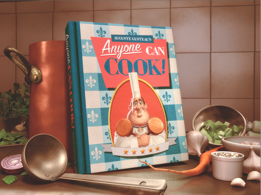
Is this a lie? Not really, because we don't know that the business or product ISN”T good. Heck "3 college droppouts working out of their basement" turned out to be these guys.


"But more importantly, I'd say that the one who THINKS to add such detail, to hire a good designer in the first place, to spend the time and money on such discrepancies; is most likely to carry that same thought and effort into the rest of what they do.

I'm sure you've all heard the expression: “You can put a tuxedo on a pig but it's still a pig.”
Well actually it's a pig wearing a tuxedo, now.Why anyone would want to put a tuxedo on a pig, I don't really know. I guess the pig had a wedding to go to. Maybe it was an anthropomorphic pig. Well as long as he brings it back clean.
THE POINT IS:
Sure rainbow colored sprinkles won't make bad tasting ice cream taste good, but if the ice cream is already good, it might entice you to come in for a taste.


So remember designers, make sure to pay attention to the cherries and whip cream.

And clients? Make sure you find a graphic designer who's willing to give you an “EMPTY GESTURE.”


… Wait that came out wrong...

Sunday, April 21, 2013

The Real Epic Of Mickey (Or How I Developed My Style)

People ask me all the time: “How did you develop your cartooning style for anthropomorphs?”


Actually that's a lie. People don't ask me that. No one's ever asked me that. HEY wait a minute why aren't you asking me that!?

OK, so IN MY HEAD, people ask me that, and here is the answer.


First of all, I've been a life long Disney fan for, well... my life.
I idolize Walt Disney, I'm fascinated by Ub Iwerks, and Glenn Kean? The most genius man on the planet.
These eyes... how does one fit so much life into a single pair of eyes?
It's like they're “More Real Than Real”.
(cuz that totally makes sense right?)

But, of course the story of Disney doesn't start with “The Little Mermaid”. It goes much farther back, and for me, ranges much later, so without much ado about nothing, here is where our story begins.


THE REAL EPIC OF MICKEY!


No not this.

THIS!
Ahem... chapter one:

IN THE BEGINING...

There was a blank piece of paper.

Then Milton-Bradley invented the "Zoetrope” and animation was born.


Authors note: We can argue until Jackie Chan learns to speak English over who actually invented or first did animation. I don't care. That's not the point. I'm starting with Milton-Bradley, so there. *sticks tongue out*

The zeoptrope was a device that by spinning would allow a series of pictures to blend in the mind like the blades of a fan, and thus create a moving image. It was patented by Milton-Bradley in 1832 and became a bit of a fad, helping to launch a western interest in animation. It also laid down the foundational principals for the next part of the story

1877

Photography is somewhat knew on the scene. Edoward Muybridge finds himself in a pickle over how to solve a dispute: does a horse takes all four legs off the ground in a gallop? Or always keep one or two on the ground at one time. Totally an important debate right?

Everyone knows a horse keeps ALL it's feet on the ground at ALL times, DUH!

Muybridge sets up a series of cameras in line and times them to snap at different instances. He then has a horse & rider gallop by, and snaps the cameras as they go. The result? A perfect documentation of the pattern of a horses legs.
(See? I told you it was electromagnetism.)
He later discovered that these images could be projected by a reel, You could show these at parties not just as a bunch of pictures but as a live presentation on film. “Hey I know, that's just what we'll call it: A FILM

Stop motion,

The motion picture,

The rest is history.


1919

So Otto Messmer arrives on the scene. Who you say? You've never heard of Otto Messmer?!
HERESY I SAY!
Ok, so how about THIS guy, you recognize HIM?
Sorry, Felix; they didn't recognize you without your clothes. I mean bag of tricks.

It's Felix the Cat! As in practically the FIRST real animated pop culture character?
OK I'll make it simple for you.

THIS GUY


Idolized THIS GUY

Moving on...

1927

Young Walter Disney falls in love with animation and follows in the footsteps of his hero Messmer, creating "Oswald the Lucky Rabbit"

What? I thought it was a mouse! I thought his name was...

NOPE It's all wrong. Everything you know is A LIE! BWAHAHAHAHAHAHA!!!Oh, Ahem, sorry about that.

1928

Walt is working for “Warner Brothers at the time.” The big shot executives, say to themselves.
“Hmmm, a cartoon rabbit here at Warner Bros.? Nah! Would never make it.

"Oh and hey Walt we're gonna have to dock your pay.”


With that Disney says: "Heck With You" and leaves the WB behind and, due to contract agreements, Oswald too. He decides to start his own company and now has to create a new character. He thinks of a cat at first but doesn't want to compete with his hero.

Instead he creates...
MORTIMER mou... WAIT WHAT?! I thought His name was Mic...

1928


Mortimer Mouse" that's the name of Disney's new character... I'm sure we can all thank Walt's Wife Lilian for coming up with the name "Mickey".

DISNEY Trivia: Mickey's Debut was NOT "Steam Boat Willie". It was another film called "Plane Crazy"


1991

60 years into the future.
Naoto Oshima designs "Sonic the Hedgehog" he bases his design after Mickey Mouse,
That's right, Sonic is based off Mickey. Want proof? Ok here goes.

HEIGHT

EYES

 NOSE


MOUTH

LIMBS & TORSO

GLOVES

UNFORGETABLE ICONIC STYLIZING OF THE ANIMALS ANATOMY
So just to recap:
Felix inspired Mickey. Mickey Inspired Sonic.

It's like they're all brothers.


1998

Sega releases the DREAMCAST. Anyone remember this?

Well I think all 4 people who bought one will.


The "Sonic Adventure" series starts. Sonic gets a makeover Hedgehog edition. Slimmer, sleeker, spinier... blu-er. He hates Amy, loves chili-dogs, and makes more smart Alec remarks than even THIS blog can handle. As a result, a large number of “Sonic Fan Characters” now have shown up on deviant art every day for the last 10 years, shamelessly copying the style 100% FLAWLESSLY. Just how many in all?

IT”S OVER 9000!!!!!!!!!!!!!!!!!!!

I on the other hand...
Choose to be unique. I only copy the style 99%.

No the truth is, after influences from Walt Disney, Glenn Kean, Bruce Timm, and Jim Davis, I'd say my style is plenty removed from the “Sonic Anthro Style”,

But I can't forget that this is where it started.
And with That...

2008

After playing around with anthropomorph styles for years, I Taylor (G.I.B.) Gibson am inspired by the body structure of the Sonic anthros. I borrow certain traits while developing many of my own. And VUALA! My style is set; and looking good if I do say so my self......
...2011. I realize that the sonic style I borrowed from was borrowed from the style of my very hero Walt Disney.


WOW.

Saturday, April 20, 2013

To Buy or Not to Buy? (Why hire a graphic designer?)

I meet people all the time who want to go the "DIY" rout when it comes to the graphic design of their businesss:


Posters,
Business cards,
Websites (OH! So many websites!)

It SOUNDS like a good idea. A perfect way to save money but only if you can bring yourself to believe the "Chef Gusteau" philossiphy of design; That "Anyone Can Do It."
While anyon can LEARN to do most anything; I'm not backing the idea of elitism, (I am a cartoonist after all) there is still a huge difference between owning Adobe Photoshop and understanding the principals of good design. Here's an example.


Go to the cereal isle at the supermarket. Notice the boxes on top vs the ones at the bottom.

You know what I'm talking about right? You've seen it:
CHEERIO's” vs “TASTEY-O's”,
CAPTAIN CRUNCH” vs “ADMERAL CRUNCHIES”?

Fun fact:
The stuff on the bottom is most likely the same as the stuff at the top. “Joes Markets” calls up General Mills; Says: “Hey want us to keep selling your products? Make us a special generic version we can sell cheep and we'll buy it off you.

Most people probably know this. The cereal in the bag is the same brand, same product, same ingredients, same nutrition facts, (the cardboard is probably cheeper.) yet we choose to shell out 2 bucks more for the stuff above. Why?
Because of Count Chocula?
Because of a good looking shot of cornflakes floating in a bowl of Elmers Glue?
(That's right. That's not milk you're looking at.)

You see the big name company hired advertising professionals to create Tony the Tiger as the mascot for their product. Then they advertised the heck out of it and payed a talented designer to work long and hard to compose a box design. And buy that I mean a work of art; one that "jumps out at the buyer".

Not literally, of course. that would be disturbing.
 
(Clean up on isle 12!)

We don't even know what we're seeing when we look at the proffessional design. (Most of us anyway) You couldn't describe it, probably couldn't recreate it, we just see it.

Despite what we know. The packaging calls us...

“Buyer... You want this box... It's fancy!... It's colorful... it doesn't look like a 3rd grader did it...”

*A cold chill runs down your spine and you fail to see your reflection in the mirror*

I mean how many times have we heard someone say this?
(Or if not you're probably the one doing it.) And I quote:


See a fine painting; say: “My 3 year old could have drawn that.

While we can argue on the subject of artistic expression all day long, (Hmmmm, I foresee a hard hitting rant on the diversity of art and culture coming to the blog soon) the fact remains that the same concept applies to the realm of Graphic Design. What's different about this box on the top shelf, that makes us want to spend our hard erned money on someone elses endless spending spree of commercial ads and self exaltation? (Wait are we talking about politics?)
The answer is: Because the designer understood the cross section between art and science. He or she knew how to look at the image from the perspective of the shopper and format each and every detail to perfection. It took days even weeks to create, nay craft a box that when we look at it it has the appearance of quality.
-
The other? Some business executive, or stay at home mom, jumped on Microsoft Word, Uploaded a stock image of a cereal bowl, Typed the words “TASTYO's” at the top in Times New Roman, And called it a day.

There's a Look. It says: “This is real”

This is what I like to call the "Empty Gestures" of Graphic Design. In other words: we assume that if it LOOKS good, it probably IS good. If it catches our eye, maybe it's worth a second look. It's a special kind of look that requires vission. and only a real designer can give it to you.

I always say: "If you want to look professional, hire a professional." It will save you time, effort, frustration, and in the end money. And this is the case whether you're selling candy bars door to door or spending millions on on TV ads.


Remember kids Don't do your own commercials either.